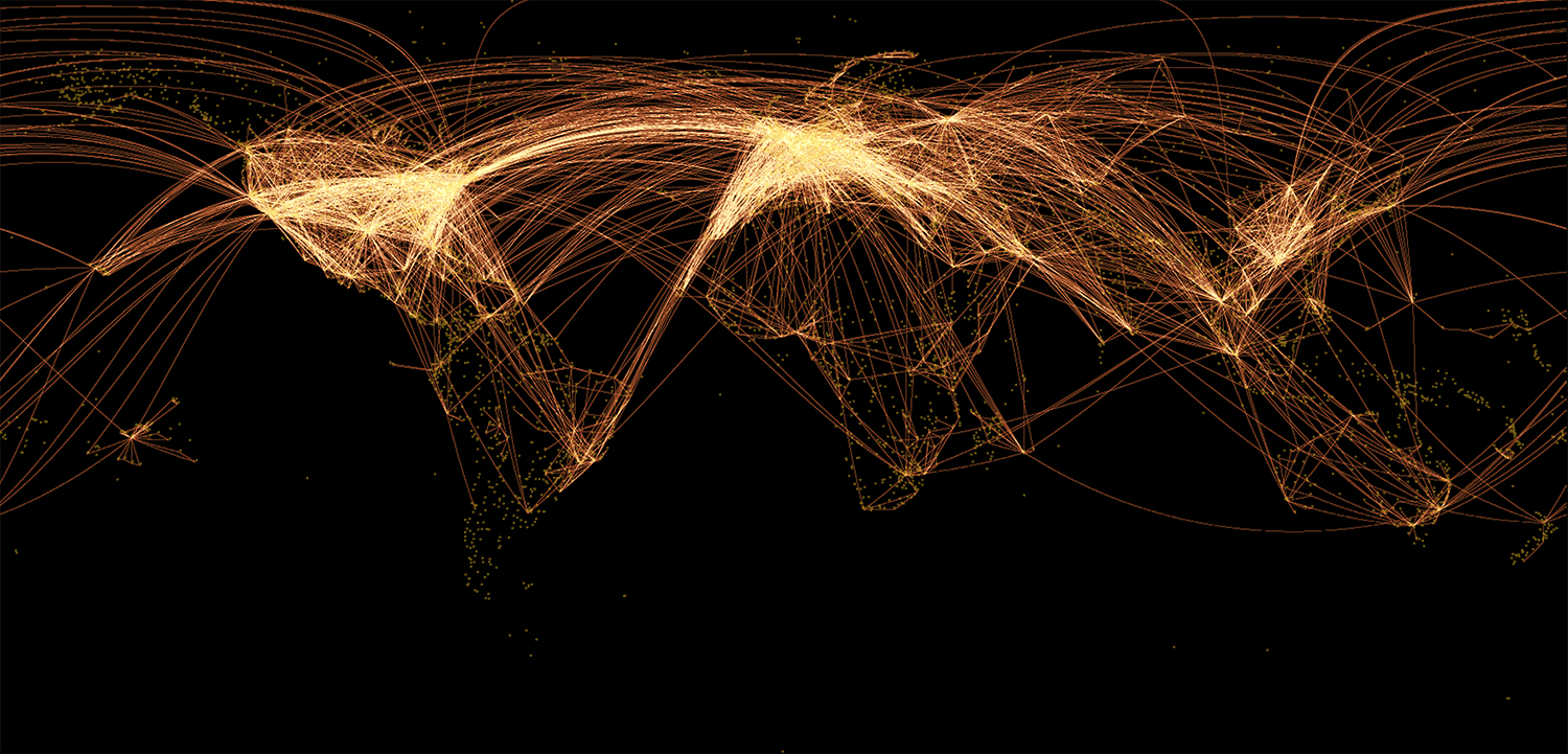
World air routes
This is an attempt to recreate the excellent map created by Michael Markieta of Arup. It includes almost 60,000 air routes around the globe and around 7,000 airports. This map shows relatively faint color for individual air routes, which becomes brighter where more routes converge. Almost all of Europe, Eastern part of the USA and a patch of East Asia are the brighter part which have extreme abundance of Air Routes. On contrary, the Southern Hemisphere is mostly dull, except for some city specific concentration.
The beauty of the map lies in the fact that, despite having no base layer for land mass demarcation, the location of airports greatly helps to curve out the edges of the world's continental mass. A variation of the same visual is prepared to highlight the density of air routes using 2 colors.
Data source: Open Flights


